Scroll down to see our projects
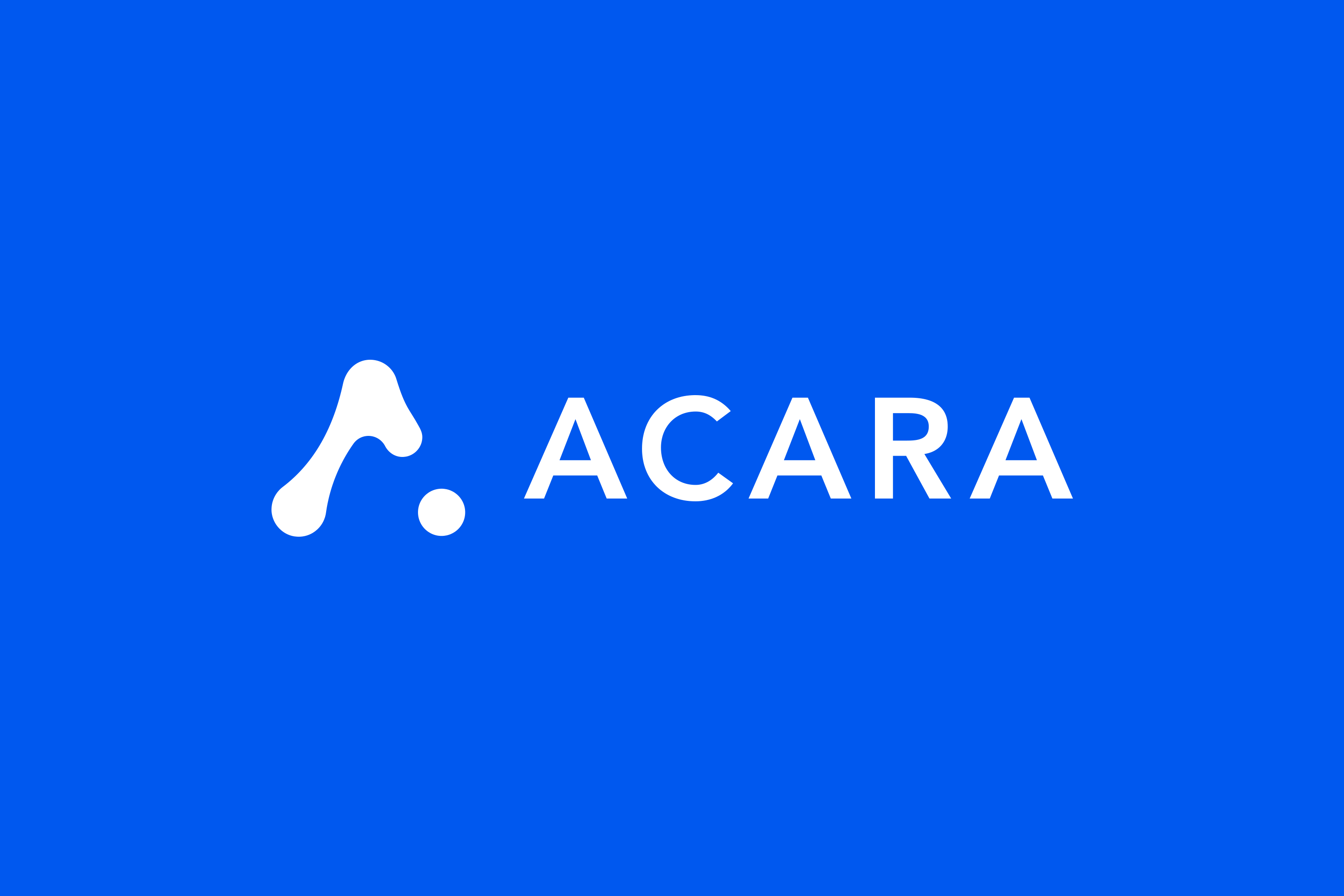
Acara
Acara is a powerful event marketing platform, enabling the users to drive business performance through in-person events. It helps the customers to create and manage their event pages and marketing assets while maintaining brand consistency.
Categories
Visual identity
UI/UX
We delivered
Concept, Information Architecture
Design & Development
01
The task
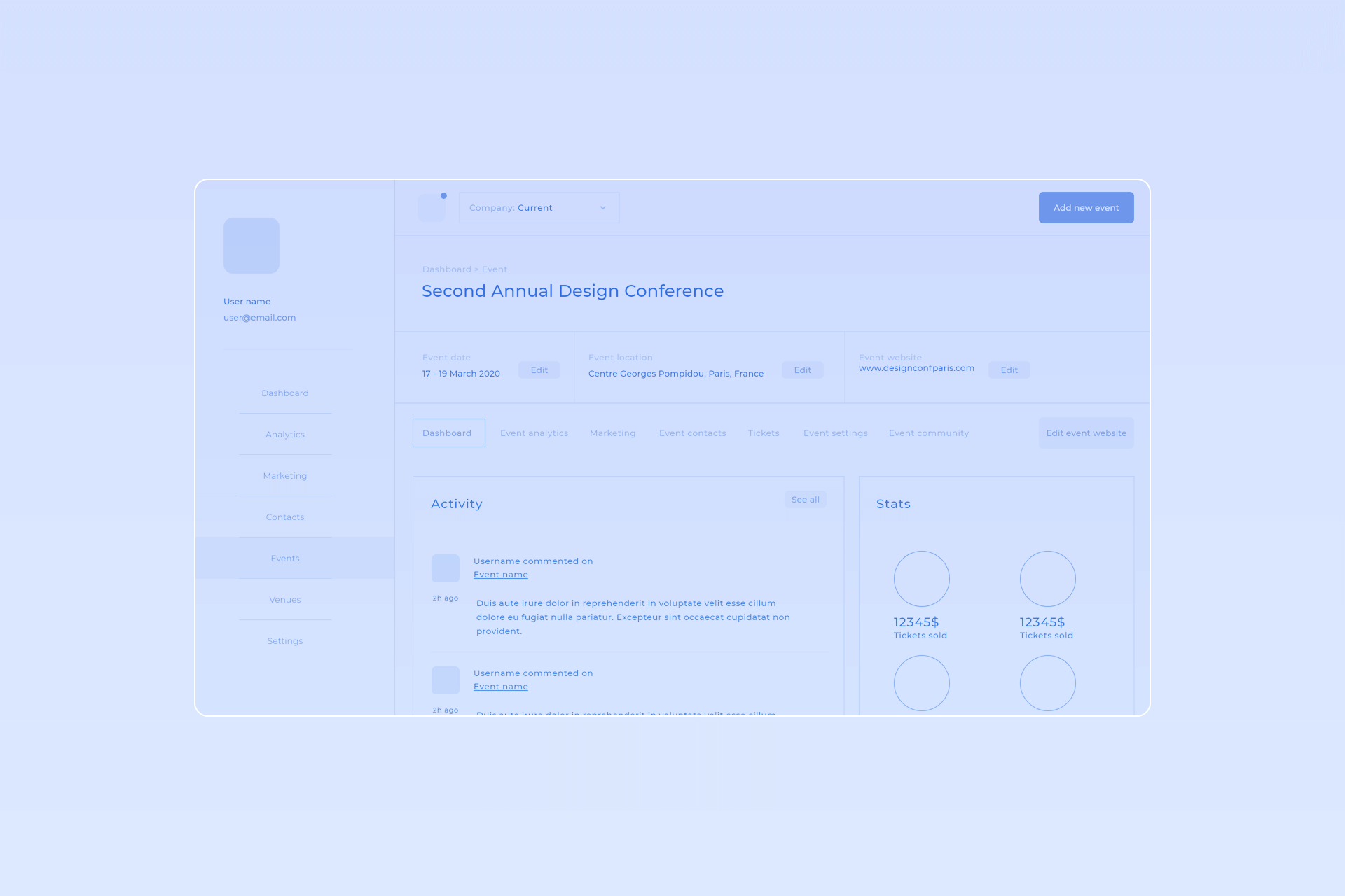
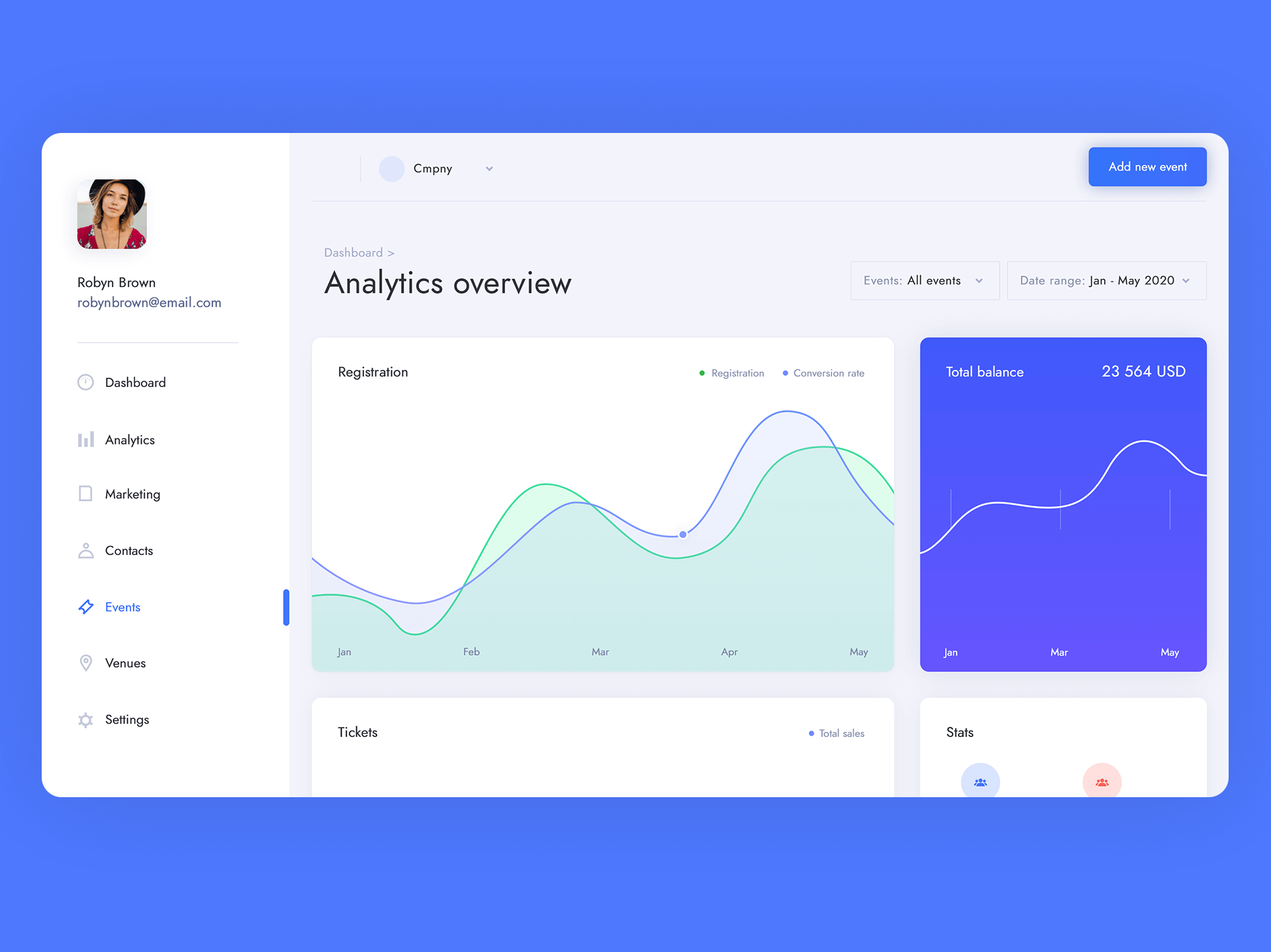
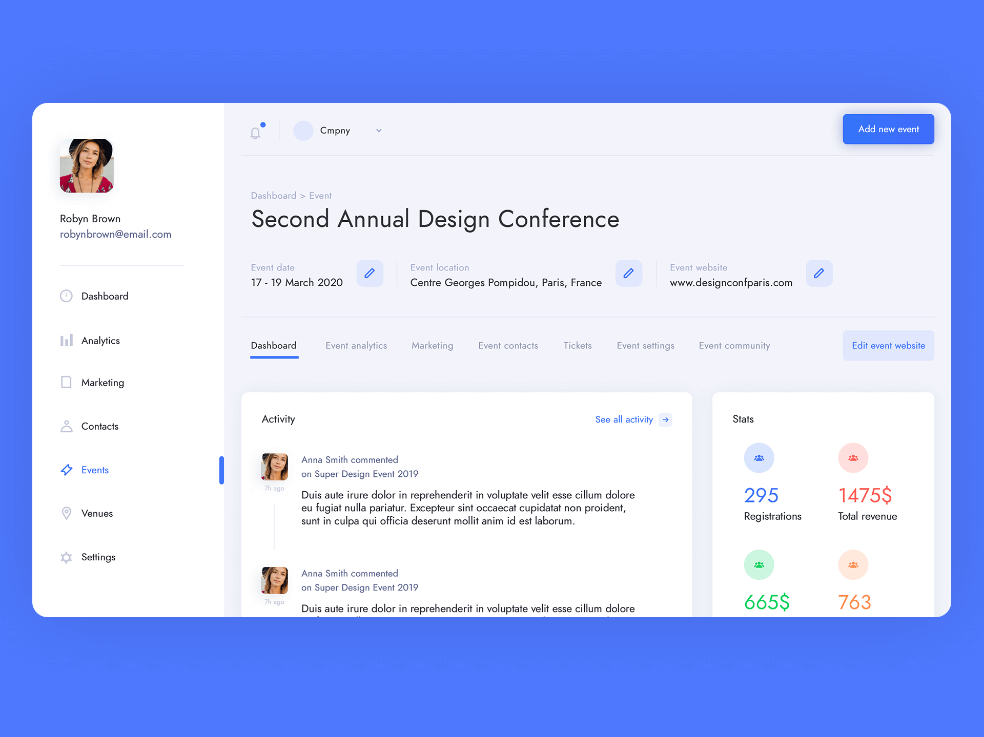
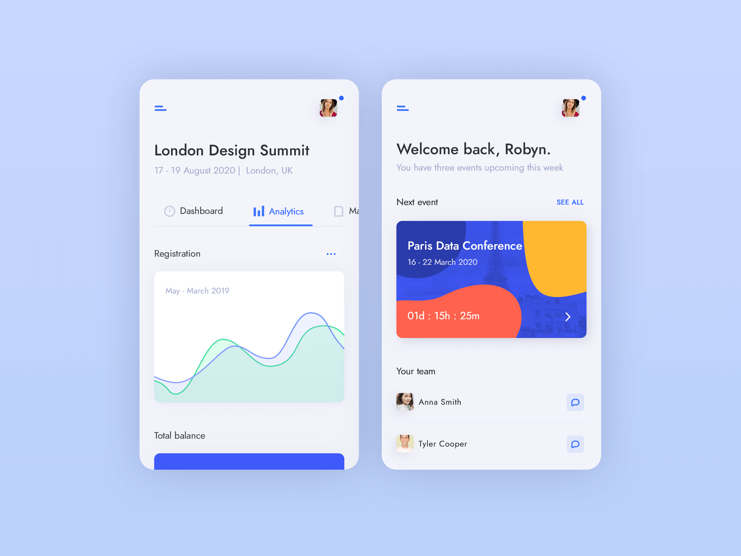
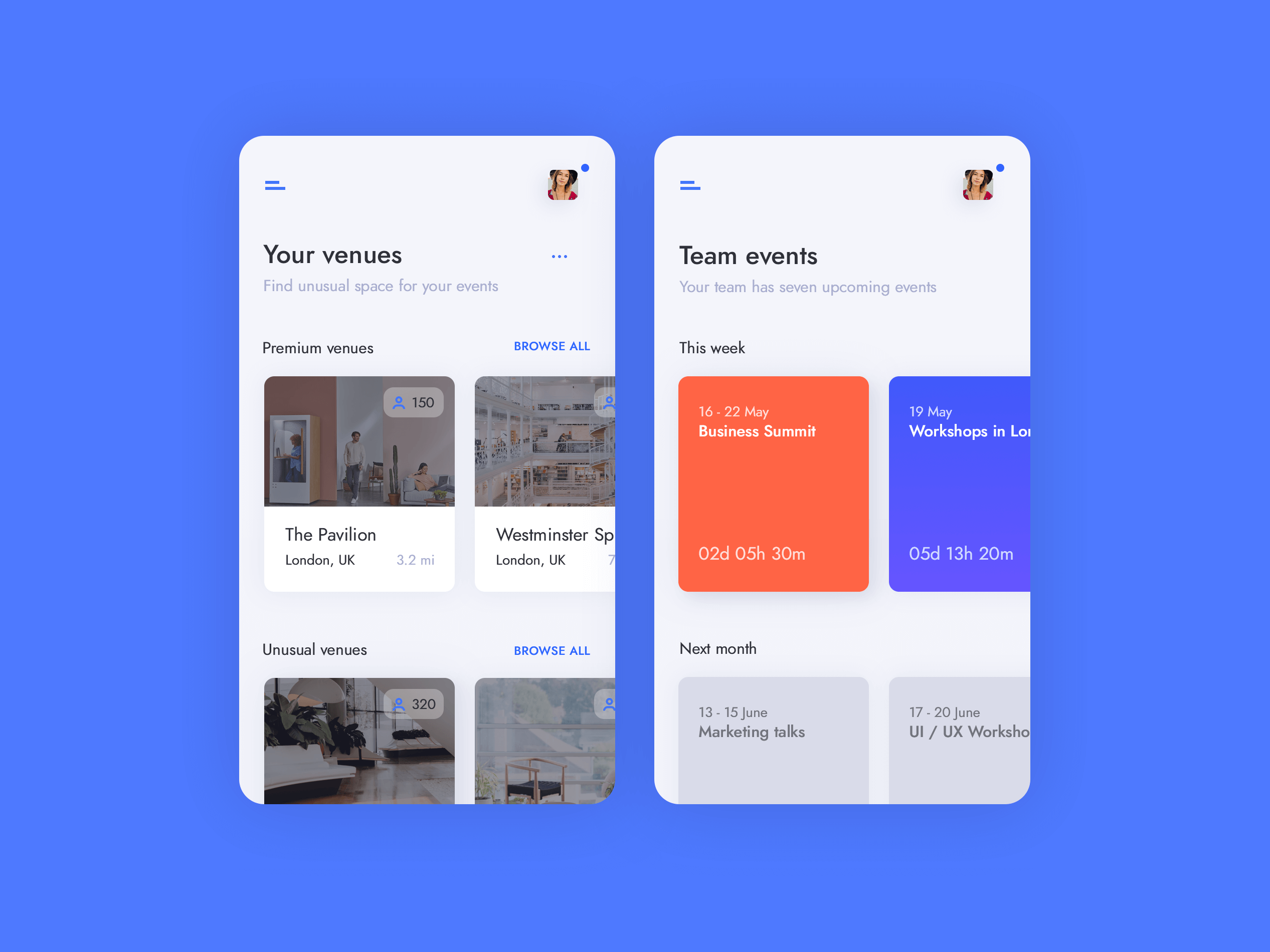
Acara needed a complete, modern visual identity build from scratch and a complex event marketing tool, offering different features to the customers. We have created simple and lightweight user interfaces for Acara app, clean, modern visual identity and a website design.
02
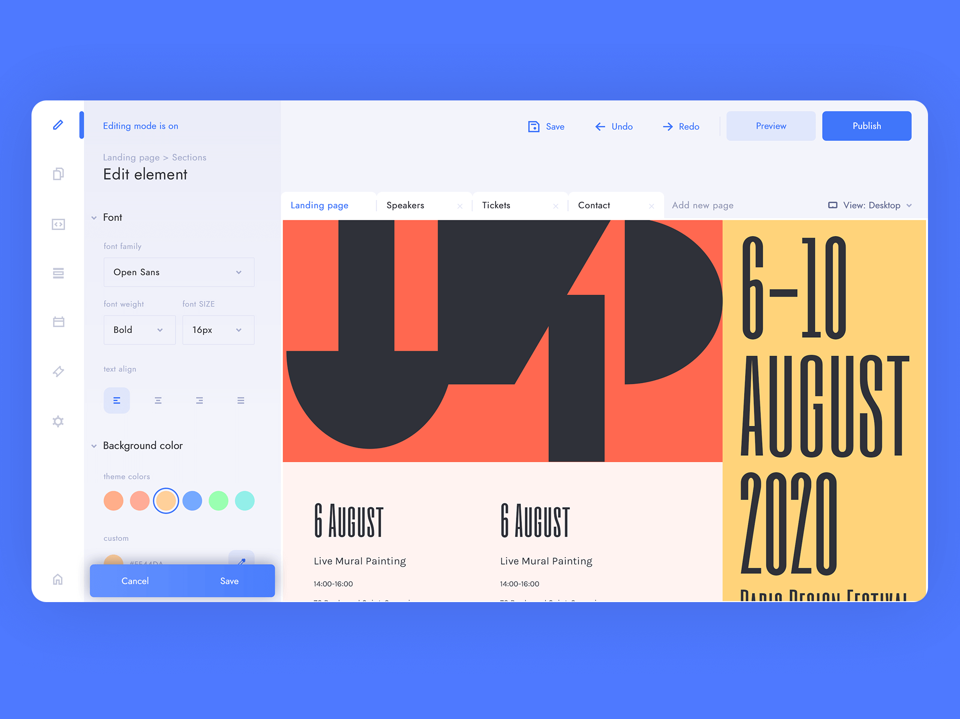
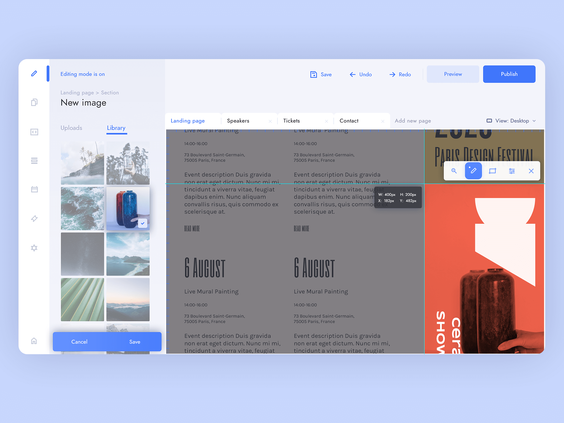
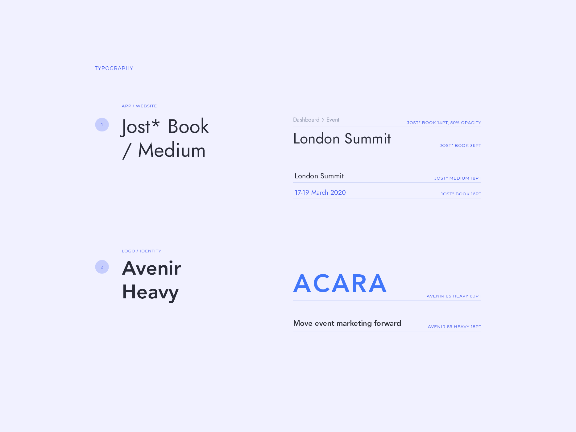
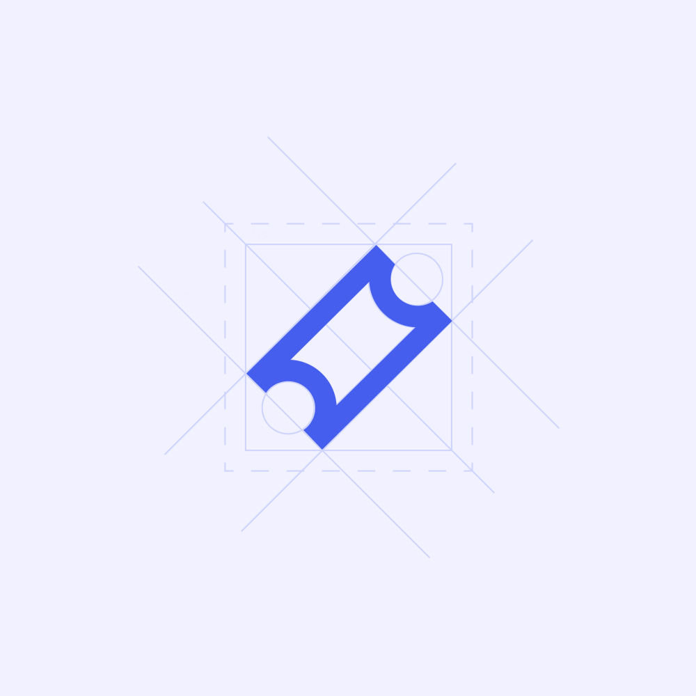
Style guide
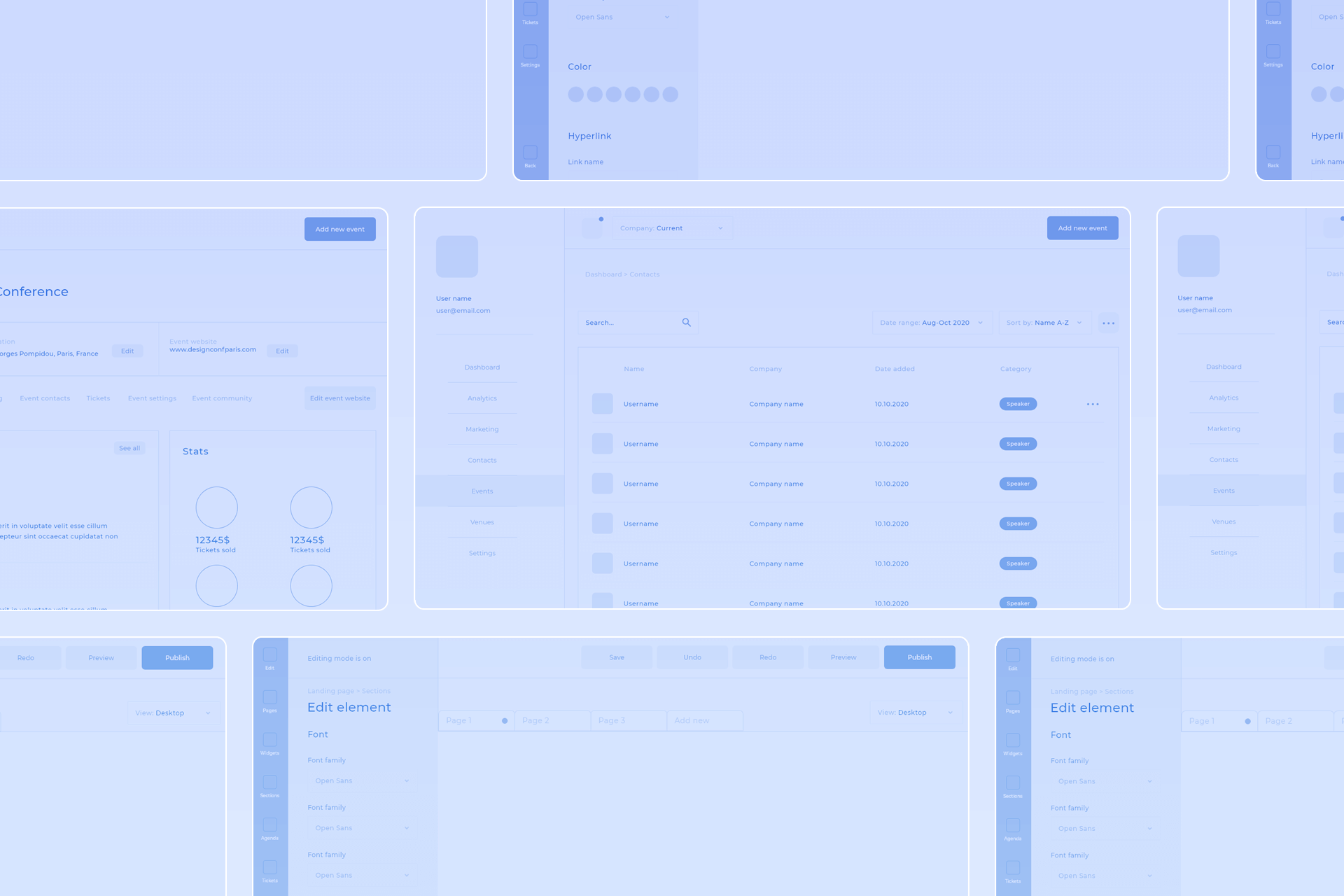
There’s a strong ongoing trend for minimal, almost ascetic designs. But Acara is complex, enterprise product with many features. And it’s still growing. That`s why we`ve concentrated on building a consistent design system. With such variety of content shown on the screen, the color palette has to be tight, yet strong and clean. It can’t interfere with users’ custom color schemes and images in the editor. Intensive Acara Blue is used to emphasize important buttons, texts and icons.To help the users to concentrate on the information and their own designs, the interface is very clean and light.
Royal blue
#5969e0
Acara Blue
#455eee
Periwinkle
#d2d8f8
Wild blue yonder
#a5adc6
Arsenic
#3c4049
Yankees blue
#17253a
Light grey
#f5f6fa
White
#ffffff

03
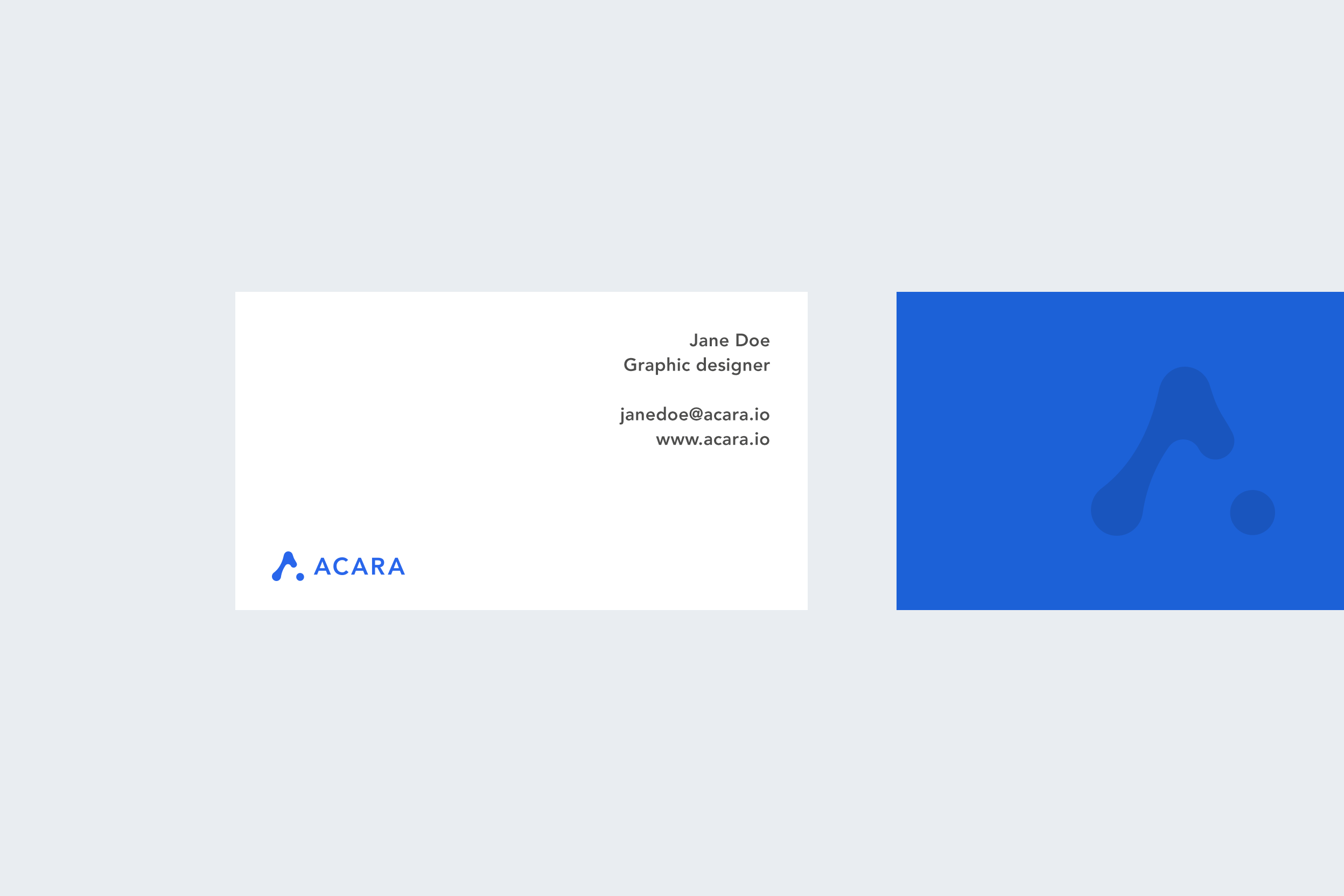
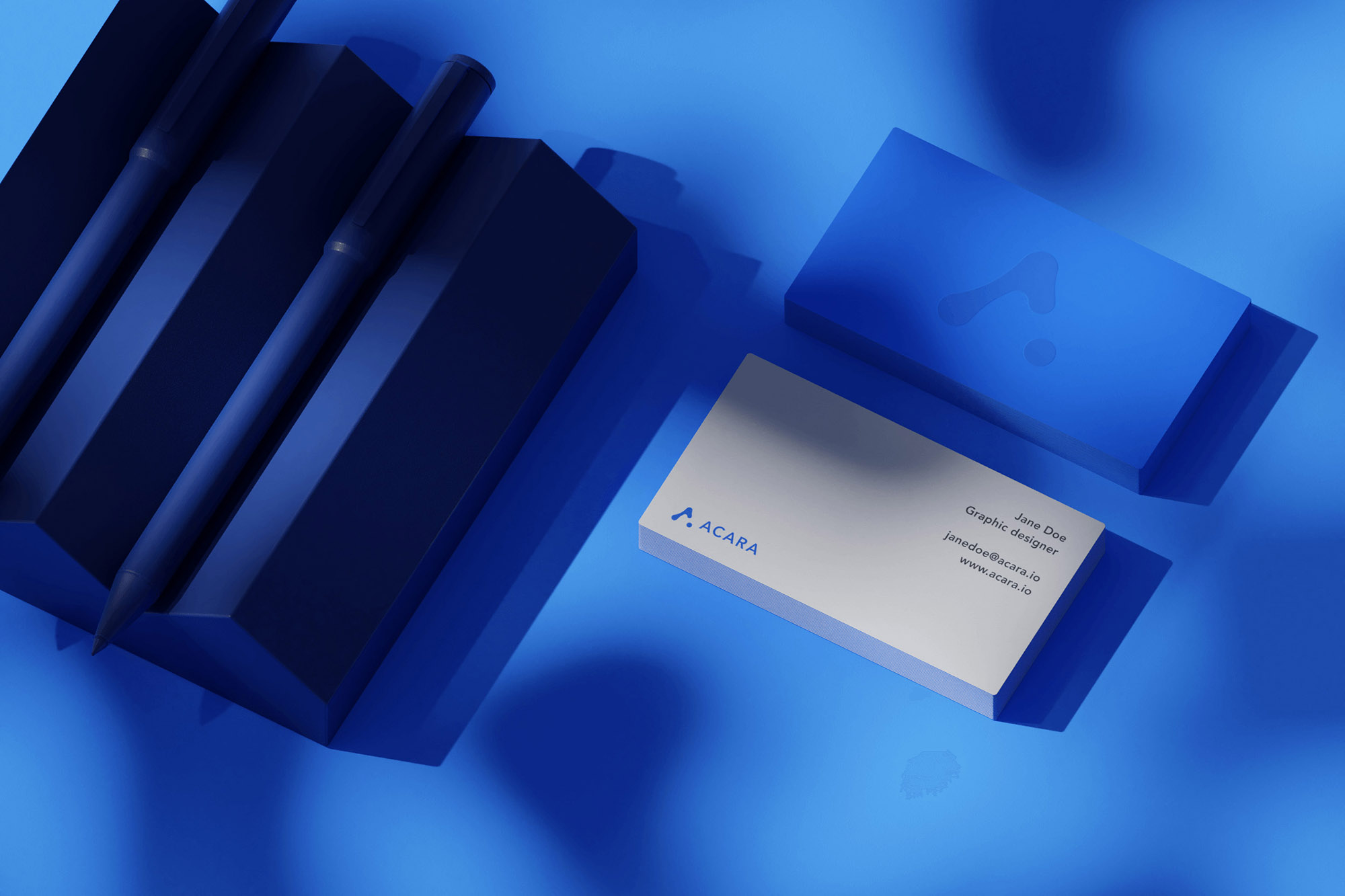
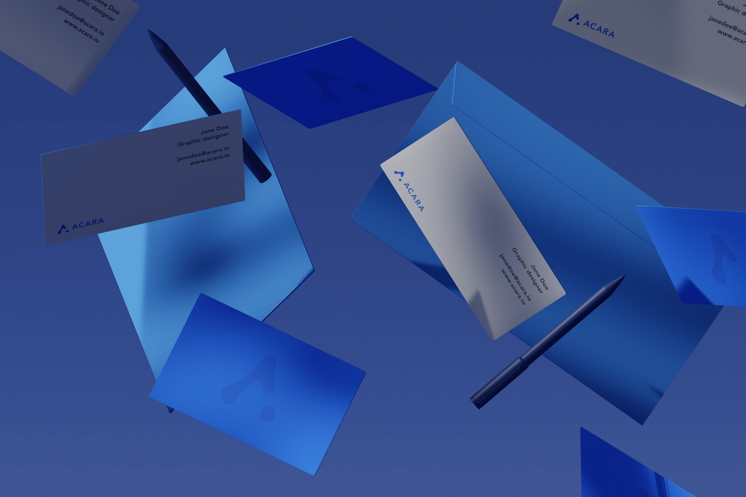
We were also responsible for designing brand identity elements, such as business cards and envelopes.

04
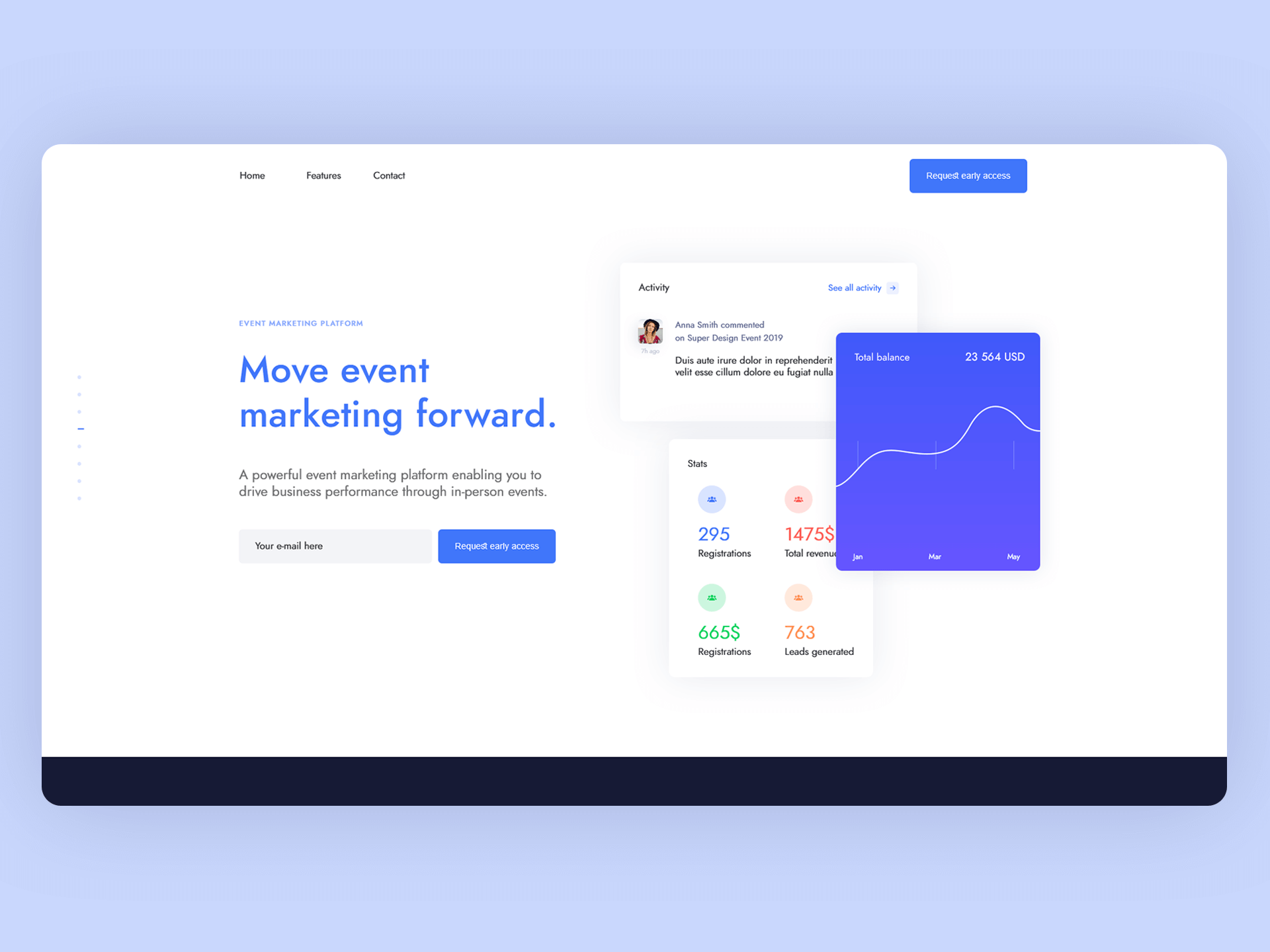
The website
The website’s simple and lightweight visual style is a perfect, neutral environment, allowing to present the product and concentrate on it’s features. Animated micro-interactions and non-intrusive transitions are paired with Acara’s color palette and neat typography.
Need something similar?
Border3px is a digital studio specializing in design and development. We can help transform your business by creating new or modyfying existing identities, products and customer experiences.
Tell us more about your project: