Scroll down to see our projects
World of Gemstones
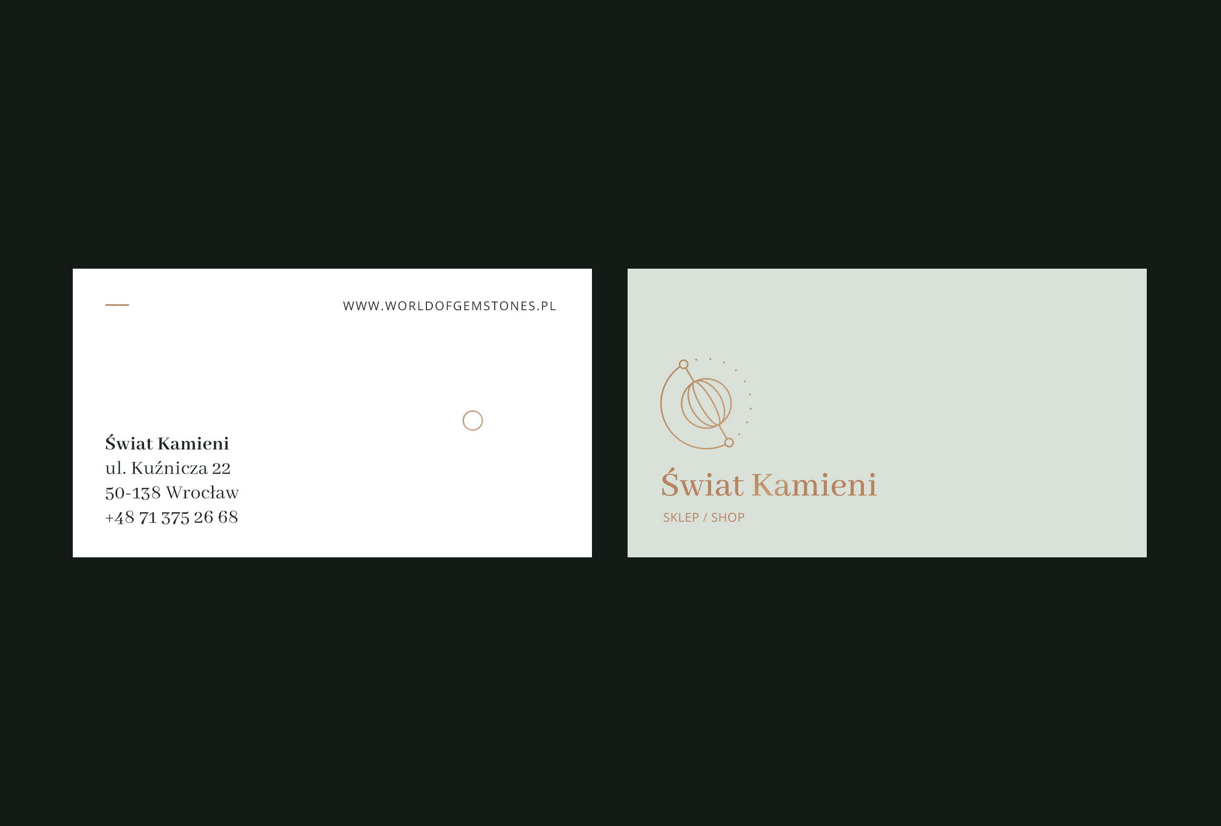
World of Gemstones(Świat Kamieni) is a small shop based in Poland.They offer various high quality minerals from all over the world.
Categories
Visual identity
Art direction
We delivered
Brand identity elements, packaging,
Online and offline marketing materials
01
Our role
World of Gemstones was opened over 15 years ago, but it did never really had a consistent identity. We had to change that. Our quick research shows that the people who shop at World of Gemstones are mostly women, 30 or older, looking for quality, classic and beauty of nature. Our main focus was to create a brand that will emphasize these values - the one that’s elegant and timeless, but not extravagant.
02
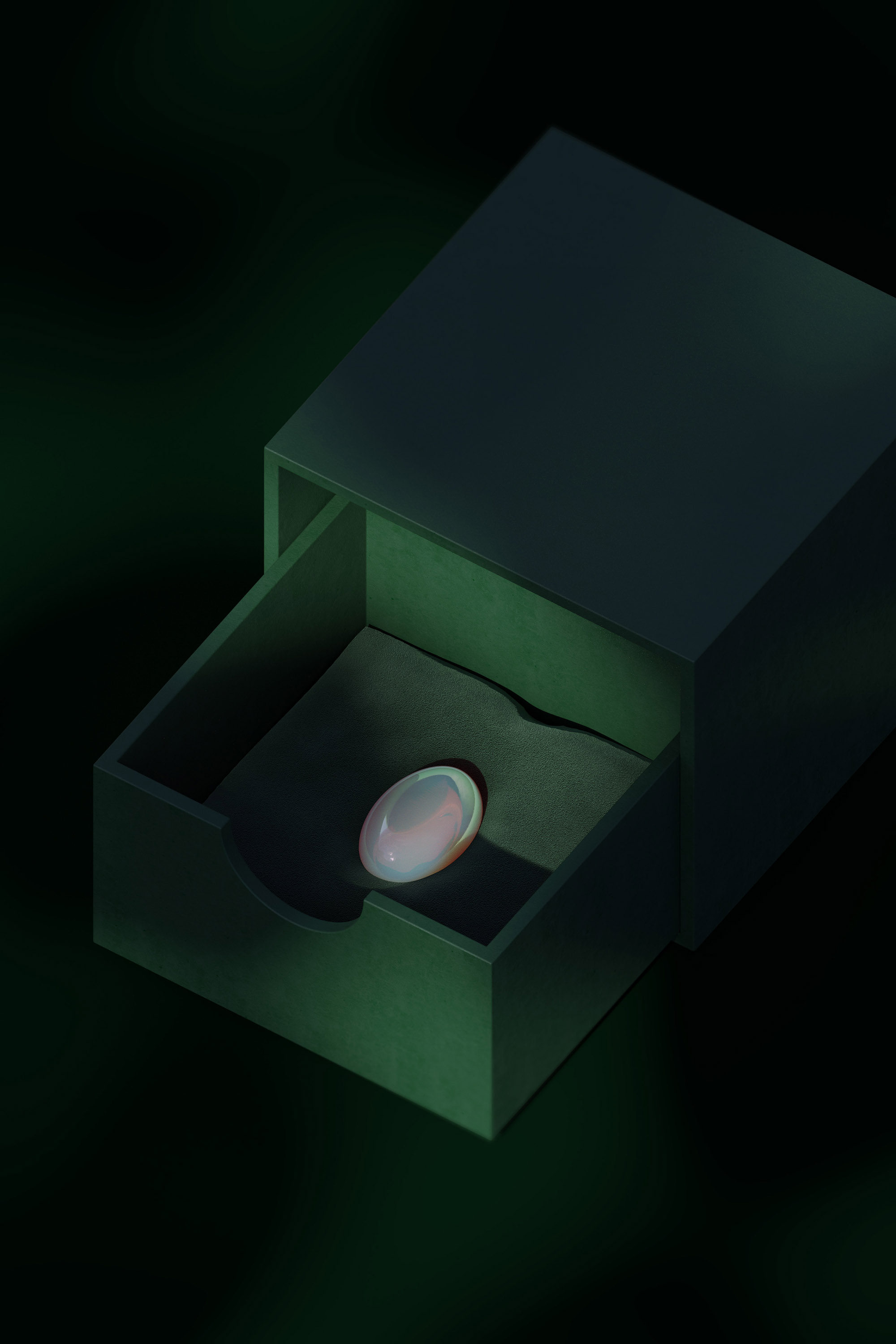
We’ve decided on the color palette that is at the same time classic and organic(but not unrefined). Deep, dark green paired with pastel beige, pistachio and light grey, complemented with gold accents. Since We’ve really wanted to avoid overused, polygon-shaped, literal representation of gemstones, we’ve looked for an inspiration in soft, ovoid shapes and linear patterns of art deco era. They are not only much more unique, but also seem to be more classic and elegant. The logomark is a subtle hint. It may be a precious gemstone enclosed on a necklace or a globe. In addition, this small set of icons was developed to represent the various ways minerals are being cut and polished.
Gainsboro
#DEE5DB
Dark sea green
#97B293
Kombu green
#354036
Cal Poly Pomona green
#10492A
Charleston green
#202A25
Deer
#B98A63
Platinum
#E7E5E3
White
#ffffff
03
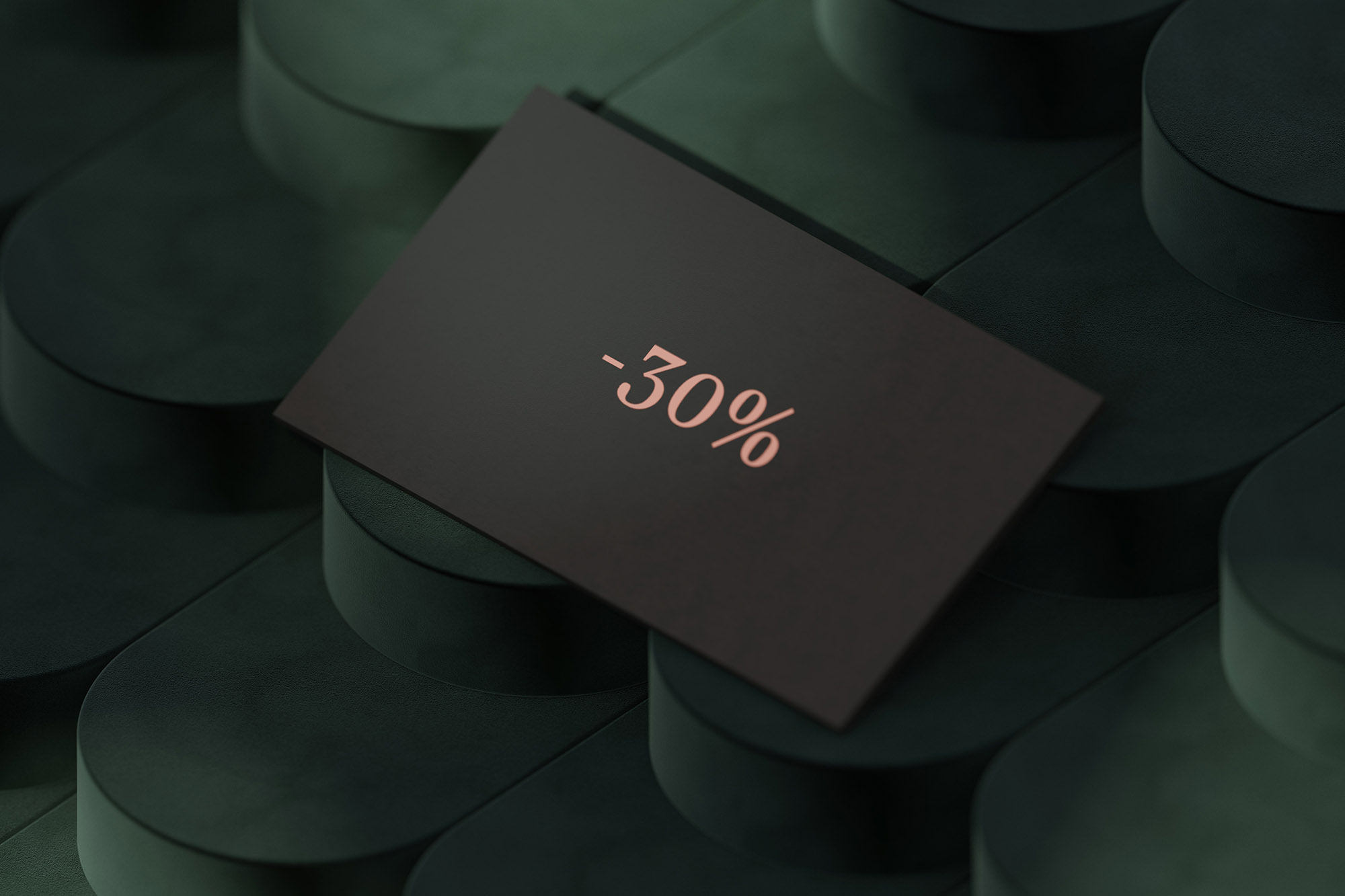
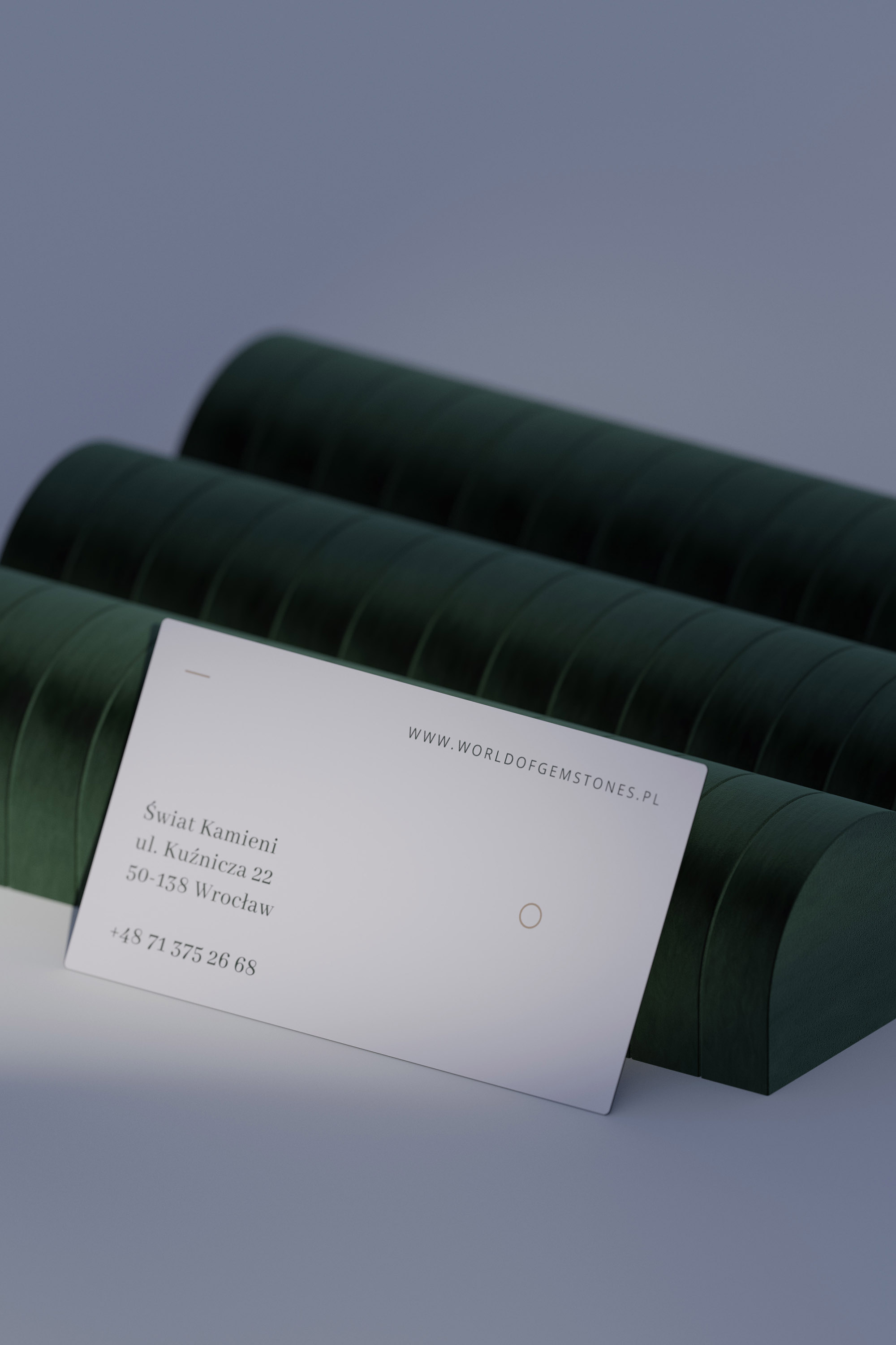
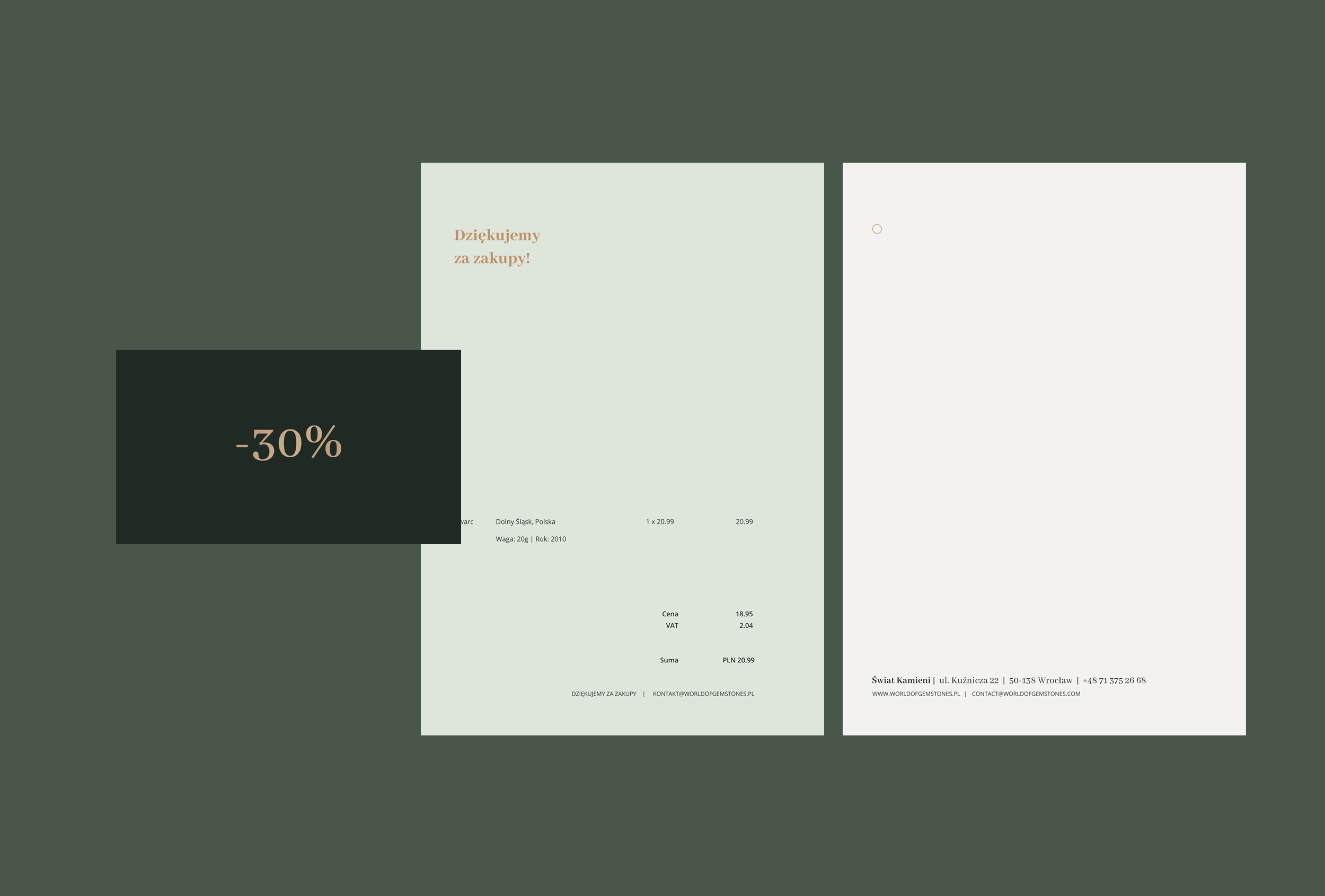
We were responsible for creating lots of different offline materials - including discount cards, labels, some stationery and invoices.
Need something similar?
Border3px is a digital studio specializing in design and development. We can help transform your business by creating new or modyfying existing identities, products and customer experiences.
Tell us more about your project: